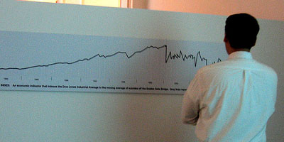
a simple graph visualization that compares the Dow Jones Index to the average number of suicides on the Golden Gate Bridge in San Francisco. the upward movement of the Dow Jones is accompanied by grey descending lines that represent the statistical distribution of suicides. currently on display at exhibition (La Casa Encendida, Madrid).
see also golden gate suicide infographic.
[ & ]
 Time and Date follows Time Zone (Brussels)