a simple & beautiful online visualization showing the incoming posts & comments on the digg.com portal in real time.
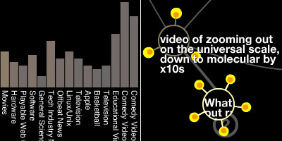
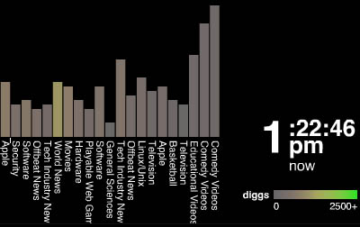
in "stack", submitted stories are represented as sepearate bar graphs. individual "digg" votes fall from above & stack up active stories.
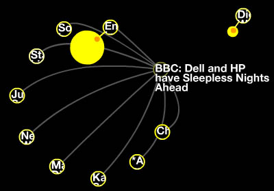
in "swarm", digg authors swarm around & make stories grow. color denotes the amount of diggs.
see also website aggregator & digg data visualization.
[|thnkx ]
MORE
 Time and Date follows Time Zone (Brussels)