
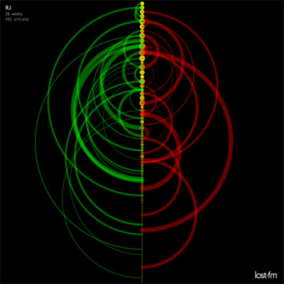
a simple data visualization of music listening behavior over time, showing how frequently listening habits change, or how mainstream specific music tastes are. the graphs represent the music choices of individual users. points represent chart positions, arcs represent chart movements, point size corresponds to the combined reach of artists that inhabited the chart position, while point color signifies chart entry (green) & exit (red) points of the song.
see also the original (pdf) & blogosphere linkology & email thread arcs.
[link: ]
 Time and Date follows Time Zone (Brussels)
Hey,
thanks for adding this! What a wonderful way to begin Tuesday morning...
Fyi, last week I did an arc diagram visualization of IRC communication behavior using a similar visualization scheme, I call it IRC Arcs