movie poster color usage

18 July 2007

movie_poster_color.jpg
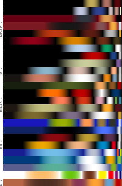
a color frequency graph depicting the popularity of colors in the final theatrical posters of the 25 top-grossing U.S. films, sorted by MPAA rating & category.

overall, it seems that black & dark-hued backgrounds are the predominant color. also, flesh tones are an alternative & recurring range of colors, whereas white is mostly only used as an accent color.

[link: underconsideration.com|via thinkingpictures.blogspot.com]

add to delicious.gif add to digg

recent entries

emotionally vague survey results 2008 presidential election in the blogosphere distributions of sport world records TerraForm people-based infographic movie subway map bathroom tiling Mycrocosm personal data graph portal Fleshmap crowdsourcing sex physical information sculptures Ben Shneiderman as interface to infovis visual poetry 2007 & 2008 wireless wifi strength heatmap debategraph debate maps John Lennon interview infographic movie analogue eco-visualization

extra

movie_poster_color2.jpg

comments

It's interesting to note that in the sorted-by-rating version, the darker colors predominate in the more adult movies. Of course, that's what originally inspired the whole thing.

A small correction: these aren't the twenty-five highest-grossing movies, but the five highest-grossing of each rating.

thnkx for the correction!

shop

post a comment