songs expressed with graphs

27 February 2008

pop_song_graphs.jpg
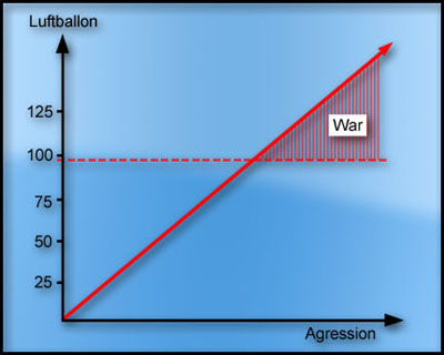
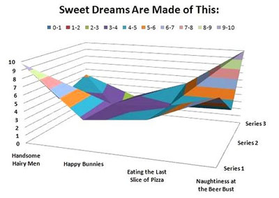
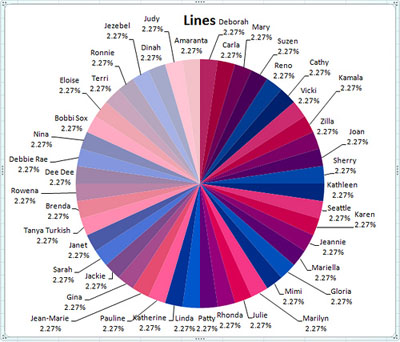
a collection of humoristic information graphs that express popular pop songs in an infographical way.

[link: flickr.com|via gawker.com]

if you are really interested in mixing humor with infographics, then see also:
- rap songs graphs
- the 10 funniest charts & graphs
- indexed doodle graphs
- music concert graphs
- personal pie charts
- graphs for flirting

update:
- Song Chart Flickr Group

add to delicious.gif add to digg

recent entries

twistori twitter message filter tweetwheel twitter network viz cocovas search visualization personal profile network graphs timetube youtube video timeline silent energy consumption visualization greenpix zero-energy massive LED display Google trigram frequency visualization Diesel infographic safety video oh shiit spelling frequency information design patterns cookbook msnbc 3D live news reader average American consumer spending wifi geographical mapping

extra

pop_song_graphs2.jpg

pop_song_graphs3.jpg

pop_song_graphs4.jpg

shop

post a comment