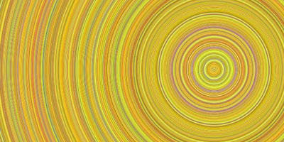
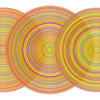
a simple visualization of the top 10 most-dugg stories of the day (by midnight) for the past year, rendered as a series of tree-ring-like symbols, moving outwards in time. rings are colored according to Digg's eight top-level categorizations. ring thickness is linearly proportional to the number of diggs the story received. trends comparisons can be made by category or weekday.
[link: ]
 Time and Date follows Time Zone (Brussels)
It looks very appealing, but what insights is it supposed to provide?
Zephyr - it easily shows change overtime, follow the link to the original site