
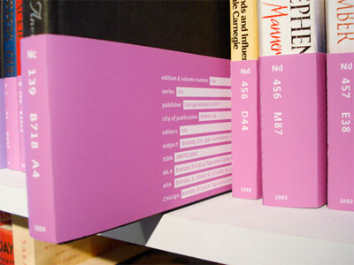
an original book label design specifically designed for structuring big academic libraries. a book's cover loses it's importance in a vast library collection, squashed between "this" book & "that" book, resulting in a mismatch of textures, typefaces & colors. as a result, it is the spine that one generally look's for & more specifically, its call number label. with so much pressure on the call number label, the tiny, inconsistent sticker to be slapped on inconsistently seems designed carelessly.
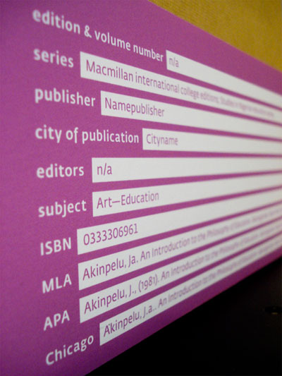
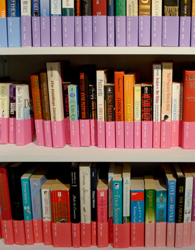
instead, the wrap around label system system uses the 1st letter of the call number to classify every book into 1 of 21 general subject matters, resulting in an information book shelf grid. colors are assigned to the subjects as a rainbow gradient, while all additional information is listed on the back
[link: |thnkx Valerie]
 Time and Date follows Time Zone (Brussels)
That's brilliant! Truly informational and aesthetic. Good job Valérie Madill.
wow, now why didn't i think of that before??
I wonder if someone have come up something similar for 'infoganizing' (informative organization) for piles CD-r's.
This reminds me of the time I worked at a research center and one of our sorta crazy women who changed her name ever few weeks rearranged our reference library. I went out looking for a text, and couldn't find it, and was trying to figure out what system we were using to organize things, and finally asked one of the receptionists if she knew where the mathematics books were, and she sort of sighed and shook her head and said, "step back."
I did, and realized that the lunatic had reorganized everything *by color.* Insanity. Stupidity.
Maybe if we could just get rid of any pesky writing and "mismatch of textures, typefaces & colors" in or on these books, it might please "designers" like this more. Not to mention the barely-distinguishable gradient color scheme. I wonder if these loons are related, and if this designer has ever read a book. With words in it.
What a waste of time and more importantly paper/ink!!! I really wonder how your whole house looks? I bet it's like a showroom catalog. Chaos is also a system.
Absolutely beautiful, but completely and utterly useless. How long do you think they'd last? I work in a library, and apparently she's never been in one. Books are supposed to be read, Valérie, not just put on a shelf to look pretty.
It's one of those ideas that seems brilliant for a second, until you think about it and realize it's actually retarded.
Gorgeous!
This is both beautiful AND perfectly functional. In response to the naysayers, I can say that there is nothing in this system that would negatively impact library organization. These express exactly what is already there on more traditional call number labels, but add an additional element -- color -- that makes it easier for patrons of locate subject areas and easier for staff to notice out-of-place items.
"Absolutely beautiful, but completely and utter useless."
I agree with that! It looks nice on the shelf, where the covers are indeed hidden, but when I, for one, check a book out and take it home I like to see the actual cover. This wrapping would, then, irritate me.
And, yes, what's it made of? How easily can it fall off, be taken off, or ripped?
Also, while the typeface is, yes, bigger than that usually found on call number stickers, it's much smaller, less distinctive, and therefore more difficult to read at a glance than the title/author already printed on the spine.
Plus, I'd guess that it takes longer to stuff a book into one of these than it does to put a sticker on the spine - an important consideration when there are a lot of books to process.
And who, exactly, uses some of this information so much that it needs to be so prominently displayed? Name of publisher? City of publication? Do librarians really care about that on a minute-to-minute basis? Do most patrons EVER care?
"specifically designed for structuring big academic libraries"
which is why the info is prominently displayed.. it's mildly annoying you have to look up this stuff and it's scattered on several pages. Multiply that by like 10-15 and you get a paper.
what does PB F COU mean on the spine of a book