
several online information graphics that illustrate the causes or relative dimensions of the ongoing credit crisis. while there are plenty of stock market graphs out there, which ones attempt to communicate the mechanics or meaning behind the current crisis? & which ones did I miss?
. A Year of Heavy Losses (treemap) []
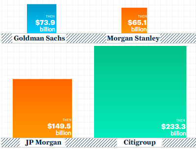
. The Downturn in Facts and Figures (collection) []
. How a Market Crisis Unfolded (event timeline) []
. The Finance Crisis (graphs) []
. Business Knowledge Maps (network maps) []
. Crunched by the Credit Crisis (bubble graph) []
. The New Global Wealth Machine (relational chart) []
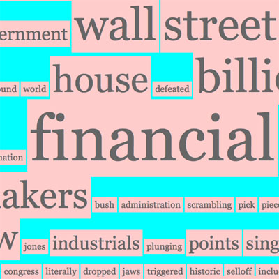
. Headlines as Tag Cloud []
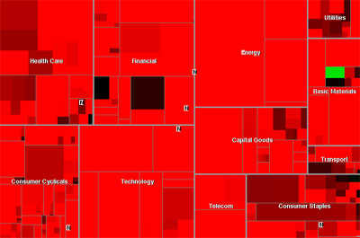
. Map of the Market (blood red treemap) []
UPDATE
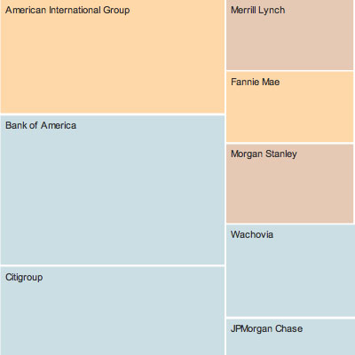
. History of U.S. Gov't Bailouts (bubble graph) []
 Time and Date follows Time Zone (Brussels)
http://www.zeitgeistmovie.com/
Site suggestion: Can the images at the top of each story link to their sources?
Nice figures.
Thanks for posting!