
[spamvisualization.net] contains a small collection of beautifully stylized data visualizations based on the data retrieved from the .
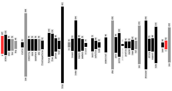
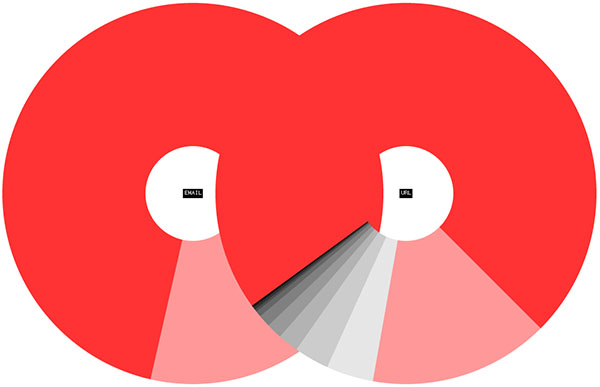
The available data visualization techniques include a (sorted by date, size or IP number), a (sorted by count, alphabet or length), a (the circles show the ratio of the toplevel domain endings in emails and link URLs), some , and a (shows the spam income of the last seven days, with color depending on the amount per hour.).
More visuals are available at . Thnkx Kim.
 Time and Date follows Time Zone (Brussels)
Its a humble visual microbiologist maintained occasionally by Paco Corries about aesthetics, information aesthetics, information visualization, visual theory, HTI (human-things interaction),human- centered-design, art and photography.
-----------------------------
bill williams
Melbourne