
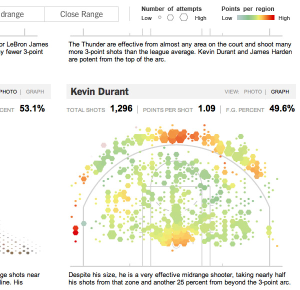
The interactive infographic " [nytimes.com] by the New York Times combines pure eye-candy with sophisticated statistical display, as it conveys the overall shooting patterns of the players on the and the .
The size of a dot on the court map corresponds to the number of attempts at that location, while its color depicts the actual points scored at that location. The maps are based on court maps and analysis by , who is a professor at MSU and Harvard, and the creator of .
Users can filter the maps by 3-pointers, mid-range or close-range shots. Or they can simply enjoy the exploding hexagonal depictions of the most popular team players, of course.
Via .
See also:
. Nike NBA Post Season Twitter Playoff Treemap
. NBA Basketball Team Statistics Heat Maps
. Data-Augmented Basketball Jerseys
. Nike Basketball Family
 Time and Date follows Time Zone (Brussels)