digg data visualization model
29 June 2006

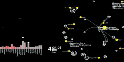
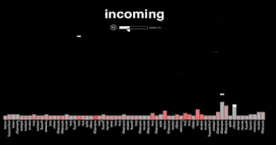
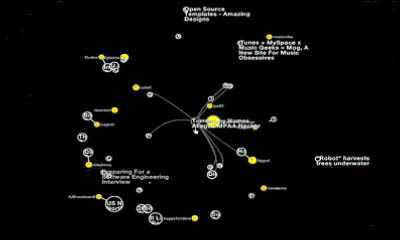
coming soon: a real time visualization map showing the incoming posts & comments on digg.com. users can use a slider to show more or less content per page, to explore the diggs "come in" & cluster around a post.
see also digg dot diagram & urlyart.
[maxkiesler.com (movie) & digg.com]
twistori twitter message filter span> tweetwheel twitter network viz span> cocovas search visualization span> personal profile network graphs span> timetube youtube video timeline span> silent energy consumption visualization span> greenpix zero-energy massive LED display span> Google trigram frequency visualization span> Diesel infographic safety video span> oh shiit spelling frequency span> information design patterns cookbook span> msnbc 3D live news reader span> average American consumer spending span> wifi geographical mapping span>


