
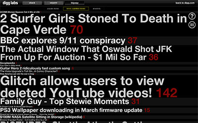
a textual visualization that places Digg stories at the top of the screen as they are dugg. as new stories are dugg, older stories move down the list. the Digg count is listed in red. more popular stories have more diggs & causes larger "waves" to visually propagate through the other stories.
(one of the other Digg Labs' tools, Stack, seems also updated)
see also the previous digg visualizations.
[link: |via ]
 Time and Date follows Time Zone (Brussels)
Oh, no! Web 2.0 ticker tape!