
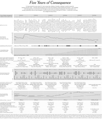
a quite extensive NYT infographic depicting the 5 years since 9/11 in the context of important world events, approval ratings, Homeland Security Threat Levels, US troop fatalities, the weight & blood pressure of George W. Bush, Woody Allen films, word frequencies in State of the Union addresses, top baby names, house prices, number of unemployed people & so on.
[link: (pdf)]
 Time and Date follows Time Zone (Brussels)
awesome. love the type
Since it's a PDF, it would be nice if it were composed of vectors -- I'd certainly print a copy for my wall.