
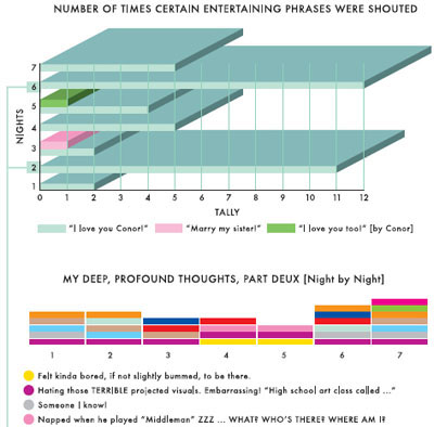
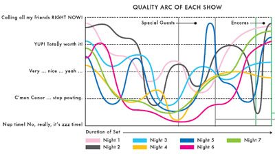
a set of colorful infographics illustrating all 7 recent Bright Eyes music concerts at Town Hall in Manhattan, made by artist Andrew Kuo. the data from these shows are meticulously analyzed & translated "into complicated, brightly colored charts & diagrams". "the joke is, the more banal the information or sweeping the generalization, the more complex the graphics."
the infographics visualized a creative set of concert-related aspects, such as "number of people onstage at the end of the encore", "quality arcs", or the "number of times specific entertaining phrases were shouted".
[link: (article) & (graphic) & ]
see also visual jazz improvization & 5 years of consequence.
 Time and Date follows Time Zone (Brussels)
Interesting find, I love to see that people are coming up with new ways to visualize information