
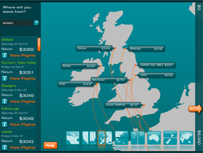
an intuitive visualization illustrating how far an Air New Zealand customer can fly depending on the estimated price of a flight ticket, represented on a world map.
[link: |via ]
an intuitive visualization illustrating how far an Air New Zealand customer can fly depending on the estimated price of a flight ticket, represented on a world map.
[link: |via ]
 Time and Date follows Time Zone (Brussels)
Its a great idea, I am glad to see that companies are taking time and effort into creating new ways to interact with users and visualize information.