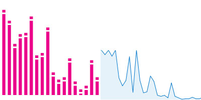
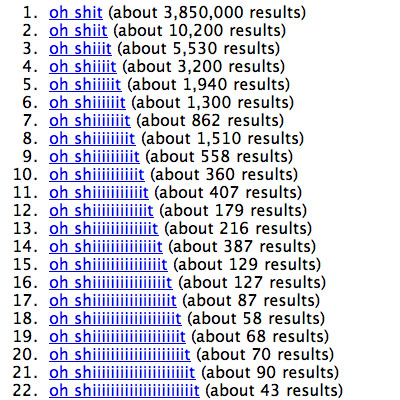
another example of a spelling frequency graph, here showing the relative distribution of the different spellings for the terms "ohshit" (vs. "oh shiiiiiiiiiiiiiiiiiiiiiit") & "damn" (vs. "daaaaaaaaaaaaaaaaaaaaaaaaaaaaaaamn") based on the data reported back via the search results from Google.
[link: & |thnkx Mart!n]
see also:
. aargh spelling frequency,
. aah spelling frequency.
 Time and Date follows Time Zone (Brussels)
And in Spanish: buscando mierda :D
I wanted to do this years ago for Kha(x)n!
Interestingly, the number of Google hits has increased by one for each of the terms (since ohshiit.com has been indexed by Google itself).
I did the same sort of thing a few years ago with "2nd annual" to see the survival rate of events.
http://ry4an.org/perseverance/
this data would be better presented logarithmically..
stock charts too...