
Two relatively similar tips recently arrived in the infosthetics suggestion box.
Anna points to a [.wmv, radar.zhaw.ch] created by that shows all the flights within a timespan of 24 hours. Each airplane is represented as a moving yellow dot on a world map. One can clearly perceive the changing dynamics from daytime to nighttime.
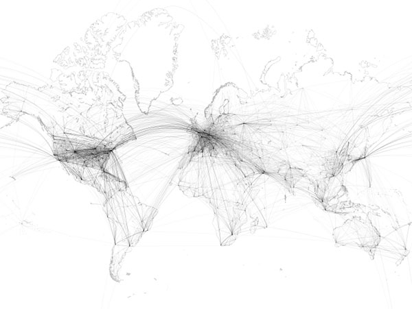
Mario points to [lx97.com], an art project showing worldwide airliner routes on a world map. Every single scheduled flight on any given day is represented by a fine line from its point of origin to its port of destination. As a result, a net is formed out of thousands of lines. Hubs like JFK, FRA or DXB turn into dark knots where lines meet, lesser served local services are only are a subtle hint. The maps is also commercially available as a poster.
If you like this sort of thing, be sure not to miss Aaron Koblin's famous Flight Patterns, Daily FedEx Airplane Routes, Britain Seen from Above and yesterday's Just Landed.
 Time and Date follows Time Zone (Brussels)
I wonder if you could see me on the flight there. Difficult to make out but fascinating stuff, well done.
Hi fascinating, I saw demonstration today on French TV. What is the link to see it live from my computer? Thanks
I totally love the design of the black and white map by Mario. It's my new wall decoration @ work. Go get it!!