miniature earth
11 September 2006

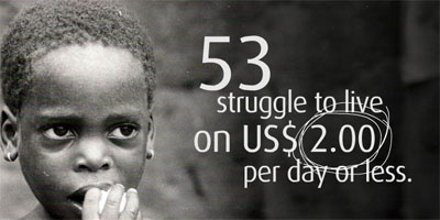
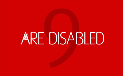
an animated textual narrative that describes how the world population would look like if it would be turned in a small community of 100 people, keeping the same proportions of today. it describes & illustrates the proportions in terms of continent of origin, race, religion, water resources, poverty, literacy, & so on.
see also gapminder & govcom & world population one.
[miniature-earth.com|thnkx Martin]
emotionally vague survey results span> 2008 presidential election in the blogosphere span> distributions of sport world records span> TerraForm people-based infographic movie span> subway map bathroom tiling span> Mycrocosm personal data graph portal span> Fleshmap crowdsourcing sex span> physical information sculptures span> Ben Shneiderman as interface to infovis span> visual poetry 2007 & 2008 span> wireless wifi strength heatmap span> debategraph debate maps span> John Lennon interview infographic movie span> analogue eco-visualization span>


