
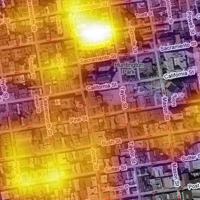
a heatmap overlaying a geographical map to depict the current rental market in San Francisco. CraigStats is based on the San Francisco craigslist rental listings since August of 2006, so the cost of renting on a per neighborhood basis is binned in 1/2 mile intervals & represented as a color.
[link: |via ]
see also trulia.
 Time and Date follows Time Zone (Brussels)
Cool, I want that for my home town as well!!!
...to be improved is that the scale of heat relative, ie the white is the visible maximum not the absolute, hence when you move on the card you cant not compare. Really, that's how to screw a visualization.
Nice.
What's 'binned'?
"binned" is a remainder from the original description. it is often used in computer science as a virtual location to store media. I probably should have used another term.