
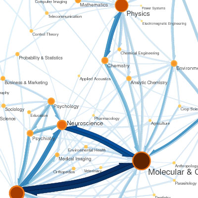
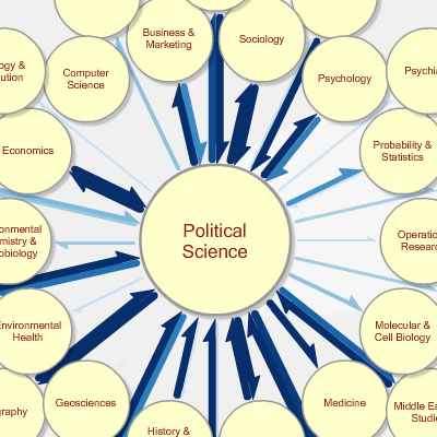
a network visualization that shows the flow of knowledge between scientific fields based on the weighting of citations by subject field. a static map represents between fields. the dataset is based on Thomson Scientific's 2004 Journal Citation Reports (JCR), consisting of 6,434,916 citations from 6128 journals.
orange circles represent fields, with larger, darker circles indicating larger field size as measured by eigenfactor. blue arrows represent citation flow between fields. an arrow from field A to field B indicates citation traffic from A to B, with larger, darker arrows indicating higher citation volume
[link: (interactive) & (static)|via ]
see also:
. map of science
. Royal Society academic papers visualization
. scientific literature citation trends network diagram.
 Time and Date follows Time Zone (Brussels)
Funny, I just blogged about it this morning:
http://well-formed-data.net/archives/148/eigenfactor
maybe we are fishing in the same pool of links? anyway, sorry I didn't see you had the scoop!
No problem at all, just a funny coincidence :)