
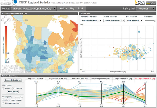
An [oecd.org] for exploring and analyzing regional statistics, in particular of the regional differences and structures of all OECD (short for Organization for Economic Co-operation and Development) member countries. The tool compares geographical maps with several other forms of beautifully rendered visual presentation (such as scatterplots and focus maps) while using different mechanisms for selecting specific groups of regions.
Also note the parallel coordinates visualization well-hidden in a bottom tab.
Via .
 Time and Date follows Time Zone (Brussels)
Such a nice tool. I´ve spend some times working on regional analysis and always wanted to find something flexible and visually atractive.
Hi,
Glad you like the tool! Please DIGG it here:
http://digg.com/world_news/OECD_eXplorer_Online_Visualization_Tool
we need visualization like a child need toys