
The combination of storytelling and information visualization has been long , although still very few examples do exist. On the other hand, some might typical information aesthetic visualization is all about tell a compelling story.
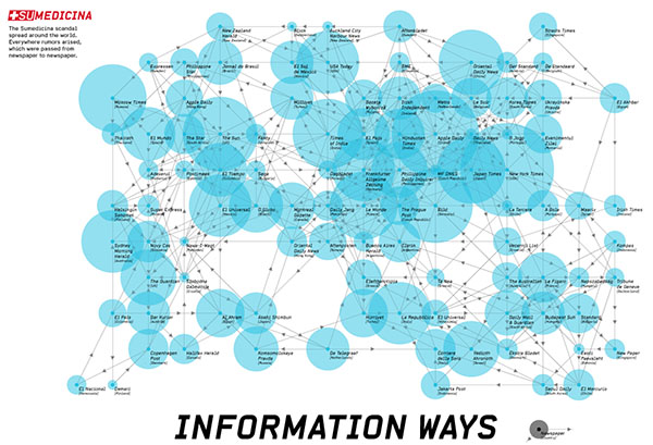
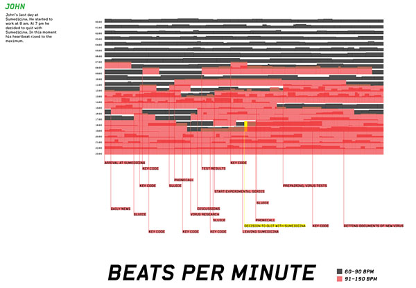
Following project takes infographic storytelling one (literal) step further: [janalange.de] is the title of a fictional thriller story about an international virus scandal, and is mainly told through the medium of infographics.
One might not feel completely sure whether this is just an excuse to create a collection of visually impressive infographic representations, or whether the narrative of the story is somehow hidden within the graphs. Answer: the short notes below the graphs at the reveal it is probably a combination of the two.

 Time and Date follows Time Zone (Brussels)
I think that every visualization (or set of graphics) should tell a story about the underlying data. Unfortunately, there are many visualizations that look quite fancy, but you need to know the story BEFORE you look at the visualization in order to understand what is going on.
hi martin, thx for your comment. and yes, you are right.
we had the idea to told a story only with info-visualizations, we created the story about sumedicina and by doing the visualizations we noticed, it is not possible to do this without any explanation. but i guess, that is not the purpose of datavis. they have the mission to make complex data visible and show facts by just one view. so they could only support a story and could be an eye-candy to make this story more counterintuitive.
at the end it was an interesting experiment.
Hi Kim,
I guess we need a distinction between datavis and infovis. My suggestion would be that datavis deals with the exploratory aspects of understanding a dataset (yes, that includes also some bits of statistics). Infovis is more tailored towards presentation, i.e., looks for the single best, aesthetically pleasing graphical representation (yes, that needs some artistical qualities) of the underlying data.
Even with this distinction there is quite some overlap between the two views and both may, or may not succeed in telling a story sufficiently.
I'm actually working on a very similar topic for my BA thesis right now. In my view, infovis without storytelling is weaker in its effect on the viewer than infovis with storytelling. Why? Well, the obvious: We like stories. We can emotionaly bond through stories. We learn better through stories. At least I do.
And if anyone else is interested, the article from the ACM communications magazine from 2001 is freely available (through another link), http://cacm.acm.org/magazines/2001/8/7284-what-storytelling-can-do-for-information-visualization/fulltext
Thierry - could I ask? Where are you studying for your BA and what is the title of your course?
hi tom - sure, but i'd rather not clog up the comments here. contact me through the email-adress on my website. it is a regular visual communication course in switzerland though.
Is there a datavis tool out there, visually appealing, that can visualize websites - like making a sitemap visual? thanks for every hint!