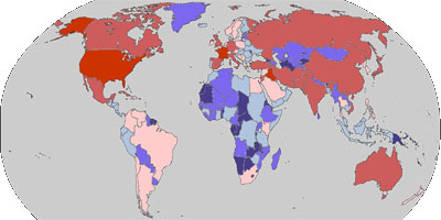
another geographical news mapping visualization, showing what countries different news agencies (Google News / Reuters / Daypop / BBC / Blogpulse / CNN / NY Post / NY Times / Washington Post) are paying the most 'attention' to today. countries in deep red are experiencing the most attention, yielding more than 3.2% of the stories detected by the system. as the red fades & blues deepen, countries are experiencing less & less media attention. static time series graphs of media attention are available as well. see also vanishing point & buzztracker & newsquakes. [ & ]
 Time and Date follows Time Zone (Brussels)